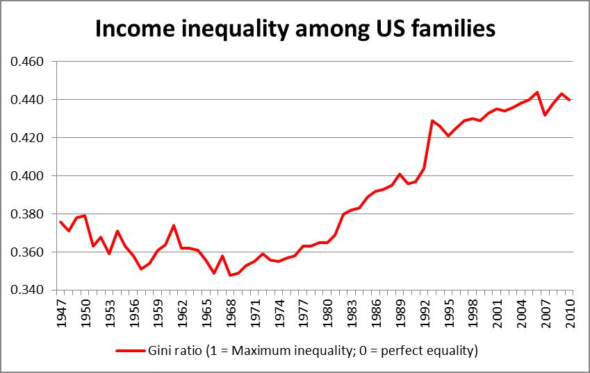

I previously addressed income inequality a year ago and would like to conduct a deeper investigation that is more factual and precise. We will first analyze a few statistics and debunk them or support them before heading into the truth of the matter. I before thought it was problematic. But I was wrong, he is my updated version.
1): The 1st Caption may convince you how income income inequality is catastrophic and how the top 1% are like super wealth pigs. You may also think that as the wealthy people get really rich, the income of the middle class drops.
Solution:
A: Actually if you consider the 1990s to be a period of great economic prosperity and that everyone was pretty happy, then it would be fair to use it as a reference point as your target. Well, it appears that if you compare the top 1% share of wealth you will see that during the period of prosperity it was at 15% and increase to 20%. Thus, the top 1%'s wealth distribution of 20% of GDP is not going to tear apart your economy like they claim.
B: If you look at the first graph, you see massive increases (and decreases) in salary for the top 1%. But if you look at the lower level folks, you see that they are steadily increasing. They are not decreasing however, this means that these super wealthy people are transferring wealth from you and to them because otherwise your salary would decrease dramatically as they increase. This is not the case in the graph; thus that can be debunked.
C: You will find that as the top 1% salary growth crashes, the lower levels don't really drop too much. This is probably because of stocks and bubbles. Actually, most of the top 1% people are heavy stock people and thus this statement would make sense. Also, if they get super rich on stocks, it does not hurt the economy at all because stocks and thus contributing to income inequality, it does not hurt people economically at all. For instance, it doesn't mean they need more healthcare, surgeries, transportation, protection, etc as any low level person. In fact, it even helps the economy if they win big on stocks because that means companies that employ thousands of workers will grow.
CONCLUSION: INCOME INEQUALITY IS NOT AS BAD AS IT SEEMS OR IS PRESENTED.
Oh, by the way. The last graph is deliberately misleading because it does not start as 0. This creates an illusion that fluctuations and changes are bigger than they actually are. It is deliberately misleading by huge proportions to trick people. And Also.... since it seems you, Crazy Clinton have coined the term "FACT CHECK" on Trump and policies that make you look bad. Maybe I should write a post fact checking you ?
How about a thumbs up ? :)
ReplyDeleteJust click on the G+1 button right above the comment.
ReplyDelete